I had enough time on a layover in
Richmond VA to visit the
Virginia Museum of Fine Art (VMFA). And less than a week after visiting
Boston's MFA. That was a cool proximity of visits. Similar to Boston, VMFA is free minus any special exhibits. They one-up Boston since it's free to everyone. The major exhibit requiring a separate ticket was
Frida: Beyond the Myth. I missed which worked out because but I barely made it through the rest of the museum. This post is a pretty big collection of pictures so I'll try to keep the typing to a minimum. Above is my museum map, the north facing facade of the museum by the parking, and water feature with Poseidon. If you're ever in Richmond and have time, I certainly recommend visiting the VMFA.
Other exterior shots. The west-facing patio with a cafe (L),
Chloe, a statue by
Jaume Plesna (C) and another shot of the north side of the building. I liked the architecture.
Here are the works that caught my eye and/or had significance (to me)...
WHY: The faces of Heckel and Kirchner remind me how energy and emotion can be captured and conveyed without overdoing the details. Another interesting thing about these is the artists knew each other and were cofounders of
Die Brücke (
The Bridge) - a group of German expressionists which had a major impact on the evolution of modern art in the 20th century.
Eternal Echoes II was the first piece I saw when entering the galleries. I thought the colors and geometric shapes are great.
WHY: I know dark paintings aren't overly popular, but I am a fan. The blues and simplicity of Blue Sea were, to me, just about perfect. And I've been to the North Sea which is depicted here - he had a family farm near the area. I had to take a shot of Composition because Kandinsky is generally credited as one of the pioneers of abstraction in western art. The work itself - I'm on the fence, but it's great to see one in person. I liked Sunflowers because of the bold lines, and because it reminds me I used to paint in watercolors (and should probably again).
L: Falcon Mummy, 664-630 BC, linen and resin
I don't often take photos of artifacts and relics, but there are always a few that win me over. The Falcon Mummy is pretty cool. Not only does it look like a falcon, but apparently the Egyptians mummified millions of animals. Even more puzzling is many of them don't contain animal remains. This one in particular had some contents (seen through x-rays) that could be remains. The Butchering is easy to miss, and the only reason I took it is because it was the oldest thing in the museum - possibly 4500 years old - and it has survived and is hanging in a wall in Virginia. Pretty cool. The Heavenly Guardian was taken more for reference for a potential future painting. Good face, garb and pose.


WHY: It's rather a pity to place some cardboard by a Reubens, but it's here for a couple of reasons. First, it's a Robert Rauschenberg whose early works anticipated the Pop art movement and he is famous for his
Combines. I thought he deserved a nod. The second reason it's here is to serve as a reminder that fame doesn't (nor shouldn't) equate to quality. When I dabbled in cardboard (see
UNICOM,
Screamin, and
Radioman), I thought the least I could do was give them some functionality. If I hadn't they could easily be called garbage. The Reubens is here because it's a Reubens. It's also approaching its 400th birthday.
C: Eugène Robert, Braccio da Montone, circa 1895, glazed stoneware
WHY: I think I've seen Guardi's painting before in print, and I've been there, so I took a pic. He was also considered one of the last partitioners of the classic
Venetian School of painting. I liked
Braccio de Montone because it is stoneware and quite impressive. There's not much info on Robert or this statue but he made three earlier versions in plaster, marble and terracotta. They were well received so entrusted a company to make colored versions in stoneware. The subject,
Andrea Braccio da Montone, was a somewhat anecdotal figure of early Italian Renaissance who embodied the typical traits of a
condottiere, a ruthless mercenary warlord. I thought that was a great contrast to the rather pleasant appearance of the bust. The third picture is rather large and I took it because it's a preparatory sketch for a ceiling. Pretty amazing sketch.
WHY: I thought the simplicity and hint of impressionism in Osbert's painting set an interesting mood. The model of
Laocoön and His Sons is here because it thought this would be something to investigate further. The figures in the real one are nearly life-size and both depict the the Trojan priest,
Laocoön and his sons being attacked by sea serpents. But the most interesting thing to me is that the original was excavated in 1506 (two years after Michelangelo's David) and has been one of the most famous ancient sculptures since the excavation and being put on display in the
Vatican Museums. I wonder if I saw this when I was there - I can't remember. The picture on the right...all I can say is they had a
Goya and I got to see it. If you don't know Goya, I'm betting you know
Saturn Devouring His Son and/or
The Third of May 1808.
L: Yaka culture,
Mbawa Mask, 19-20th century, multimedia
WHY: Masks are always interesting to me. These are just a few of the dozens on display. I thought they were some of the most unique and the amount of work involved is impressive.
WHY: It's a Rodin so it deserved a pic. Rodin was visited by an impoverished man at his studio, and his appearance made Rodin immediately think of
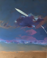
John the Baptist - cool story. The next two pictures are dark imagines but as I've mentioned, dark scenes can be great. The surrealism and mood of The Quaker Meeting are perfect, and the moonlight in the night clouds is something I would like to be able to paint.
L: Fish Caviar Dish, 1896, silver
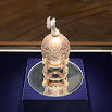
CL: Imperial Tsarevich Easter Egg, 1912
CR: Imperial Pelican Easter Egg, 1898
R: Imperial Peter the Great Easter Egg, 1903
The museum had a section dedicated to Fabergé. I'd never seen them (the eggs) in person so they were definitely photo worthy. That company has made a lot of items.
WHY: I thought the sky was great in Boudin's painting and I'm a fan of skies. The other two, while not necessarily a fan of these, they are Renoir and it's good to see his work.
CL: Dancers, 1885-1890, wax
R: Horses, 1919-1921, bronze
WHY: I thought the absence of a face in the left painting was genius - is a commentary on the person's feeling or simply a mannequin? The models of the dancers were fantastic and even more impressive that they're made of wax. Also, they were never exhibited during his lifetime. The Little Dancer is here because I saw it in Boston less than a week earlier. What I didn't know is there were only 25 copies authorized by Degas' heirs after his death. The horses resemble wax but are bronze. Degas is obviously known as a painter but his dealer once noted that when he called on Degas he was as sure to find him modeling in clay as painting. 150 wax sculptures were found in his studio upon his death - including The Little Dancer Aged Fourteen which was the only sculpture he exhibited publicly.
WHY: I appreciate the recognizable face despite the lack of detail in
Victor Chocquet. The simplicity of the Seurat is very pleasing to the eye. And of course, it's a Seurat. If you don't know his work, you'll probably know
A Sunday Afternoon on the Island of La Grande Jatte. The van Gogh? Well, it's always good to see one and I missed the van Gogh exhibit in Boston.
WHY: It's a Toulouse-Lautrec - how could I not take a picture. I also appreciate the boldness and lack of detail, and I find it interesting the person standing seems rather short. Toulouse-Lautrec was 4'8". Another van Gogh, and one I like much better. You can see how his skies and strokes are evolving. I posted the Picasso because it's a Picasso but it also reminds me of drawing exercises I did in Junior High - we drew other classmates standing or sitting in chairs.
WHY: I took the picture of Braque's painting to place next to Picasso's. Braque was a significant player in
Fauvism and
Cubism, but do you know his name? Of these two, I much prefer Braque's but that's how art goes. One could probably guess the center painting is Picasso which is a shout out to his recognizability - whether you like it or not. The Vlaminck painting could be passed off as the work of a youngster - but it's not.
WHY: I would like to ask Picasso directly if this was nothing more than a sketch. Part of me believes he'd agree, but it hangs in a museum of fine art because it's a Picasso. I'm not commenting on the quality and/or value of the painting, but more the power of a name/notoriety. Another Braque, which I think is great, and whether it was a work favored by the artist is the same question as the pigeon.
WHY: I took this pictures because I like them. The lines, the colors, the composition.
Love the The Three Orders. Also of note, it's the same guy.
WHY: Haseltine had some fantastic sculptures of animals - this horse is just one of many and he had some great boars and sows, too. The Henri has terrific lighting and really captures the emotion. Henri was rather famous in his lifetime - something many artists don't attain. I took the Sargent because I'm a fan. I find this particular piece a bit busy but I'm still a fan.
WHY: I noticed the left painting across the room and had a hunch that it was a Homer...and it was. It's here because it's wonderful but also because it's a Homer. If you don't know him, you might recognize,
Breezing Up (A Fair Wind), 1873-76. Aside from being a great, iconic painting, I think the title is great. I enjoy titling paintings and maybe Homer had a similar affection. Another Henri and in this one, I thought the trees were ideal. I took a pic of Moonlight Marine because of that moon, clouds and lit waves. A bit of a recurring theme in some of my favorites.
I thought I'd end with this - it's large, I love the story and even the raven made the scene.
- mm -


