Currently, I am trying to mold it more into a showcase in which any work can be displayed and a collection of resources. I feel Musket Media can serve artists well and particularly those who don't have a web presence. This idea is in line with the title, 'Musket Media' (must get media) - I want to gather and display as many different media as possible.
Why Musket Media? Watercolor is my primary painting medium, but I work with others all the time. Musket Media captures the idea that several things (or medium) are involved in conveying ideas or impressions - like the medium you're using right now to look at my art. Lastly, the title is also a play on my callsign, Musket.
My thoughts on art and trying to be an artist might be different than you expect, and may at first, seem pessimistic. They aren't. They're just an attempt to be humble. Also humbling (and somewhat embarrassing) is the lookback section where you can see works from my childhood.
I am pleased you visited this site and hope you enjoy it. Feel free to contact me (email) and let me know what you liked or didn't like.
- top -
ABOUT MUSKET...
I grew up in a small town in Nebraska and lived there until I left home. After highschool, I moved to Lincoln for a year at the University of Nebraska. During that year, I applied for the Air Force Academy and after being selected, I moved to Colorado for the next four years. As an aside, one of the best things about the Academy is you're done with college in four years. Who knows how long it would've taken elsewhere.
After the Academy, I went to pilot training in Wichita Falls, Texas. Phoenix, Arizona was the next stop after a few months of miscellaneous training. After Arizona, I’ve been blessed with a string of overseas assignments including Korea, Japan, Germany and Italy.
As far as art is concerned, I’ve always liked drawing and have done it since I can remember. In fact, I have a drawing of a train dating back to second grade. I don’t remember when I started working with color, but the first medium I used was colored pencils. I guess I felt comfortable with pencils so colored pencils gave me safety.
In junior high, I tried working with oils but had limited success. Another unexplainable jump was when I first used watercolors. My dad gave me his old set of the classic 8-color watercolor trays so I gave it a try. That tray was metal (due to its age), carried the Prang label and had my dad’s name on the back. Prang still makes watercolors (under a different name, Dixon) and now that set is considered vintage.


I’ve been using watercolors ever since I used that Prang set. I think what kept me stuck is how easy they are to use and how the water adds effects unattainable in other media. At Lincoln I sent some artwork to some greeting card companies in the hopes of being a "professional" artist - even if was for cards. I received 100% rejection but it didn’t bother me and they all sent nice letters (of rejection). What does bother me is that I didn't continue pursuing some other means of getting my art public. That sharing of my art is basically how the Christmas cards grew in number and the source of inspiration for this website. I have started to dabble with acrylic. Love the water-based simplicity and clean-up, but also like the ability to add thick pigment.
GRAPHIC DETAILS...
the SIGNATURE: an "L" (for Lade) overlaps an "A" (for Aaron) in my handwriting. The sphere after the "A" represents the on-going attempt for near perfection. A line at the tail of the "L" forms a cross, which needs no explanation.

the STAMP: This is the stamp which accompanies my signature and made its first appearance on Christmas Crab. It's from my Kätzchen (at the time) and it was the best birthday present. The timing allowed me to stamp 2007's Christmas card which was its first use.
the LOGO: my earlier logo was more or less a doodle - offering little association to anything other than the website address. With the emergence of Musket Media, I revisited the idea of a meaningful mark. Simple, symmetric and bold, these two Ms are the new label of Musket Media. One right-side up M superimposed on an M turned counterclockwise 90 degrees. There two versions as some sites, apps, etc, force a round avatar and/or icon.
Using MM graphics. You can use any of the images above or below.


- top -
MUSKET LINGO...
I make a lot of references to things I've experienced in the past. That's no different than anyone else, but I have a bad habit of assuming you know what I'm talking about and since I have a relatively short temper, I get frustrated when people don't follow. I wanted to use this page to begin a catalog of terms I use. Not simply to assuage my short temper but rather to share phrases that I think should be universal. The list will be added to (as it's not yet complete) and I've done my best to arrange them alphabetically.
Bladinator: Although seldom used, this term describes one thing - the "magic" plunger that stops coffee flow if you remove the pot from a coffee maker equipped with a bladinator. In other words, why the coffee stops dripping if you remove the pot before the entire pot is ready. People take it for granted but it allows us to get coffee early. The origin stems from an entire series of words, a different language if you will. An example is the transformation of the normal greeting, "How have you been?" to "How ya bun?". Or, "How have you been doing?" to "How ya bun dun?". As you can see, it is much shorter and therefore more efficient (assuming the other person knows the lingo).
Brahmai (Bra 'mE a): Brahma is a real word - a type of bull among other things but I add the "i" to make Brahmai. This is a nothing more than a reference to beer. To simplify, it's an addition to brau or brew. Truth be known, I never understood why the pickup topper (carrying the brand name Brahma) was called Brahma and it irritated me. I modified the pickup topper's name to brahmia when referencing a beer. Strangely enough, the only person who was witness to the creation of this term was Kit.
Dace: Dace, as you may know is a fish. However, it also works quite nicely as a substitute for days. For example, Happy Birthdace, lazy dace of summer, or dace of the week. It stems from my time in Japan. We were in the mode to fish and realized that dace was a common target. Strange to us for the dace is an relatively small fish (the size of minnows in some species). I still use it but the connotation is less appreciated if you haven't actually fished for dace. You most certainly can't use the tackle we were using - since most of it was bigger than a dace.
Dooch (Doo ch): Short form of Duchi (below). This is the quickest way to identify something as Duchi. Read the definition of Duchi for the details.
Duchi (Doo-chE): Defining someone who can't do things in a normal manner, i.e., always posed to "one-up". One-up defines the characteristic of enhancing any story told in at least one area. E.g., "My website had 3500 visitors last month" countered by "That's interesting, mine had about 4000".
Dutchi also defines mannerisms. For example, if asked to present your identification (whether it be an ID card or drivers license) you can simply show the card or you can present it in a way that exudes the fact that you may be better that anyone else who holds the same credentials. This is difficult to describe but the trait is immediately recognizable when seen. A quick flash of the card with a pious glace away works.
Eddress: Although I can't take the glory for this one (I will pass it to Wiz Graber) I can't believe it's not yet accepted as a word - especially by Word™. It's self explanatory. We continue to say "What's your email address?" I have to ask why. It is the 21st Century...how about we say "What's your eddress?". I'm good that "what is your email?" has become accepted.
Glory: I have several takes on glory. This is not the glory given to the Almighty, it's glory for yourself and there are several ways of obtaining it. They are listed below.
Glory Grab - this is any means by which you try to obtain all glory for yourself. A good example is when something is being discussed (only with good accolades, obviously) you quickly inform all people present that it was you idea/project.
Glory Pass - not all references to glory carry a negative connotation. You can be the bigger man, or the Anti-Duch, and ensure the glory is passed to the correct person.
Glory Share - this, too is a positive use of glory. If you really do deserve the glory, it's easy to accept, but if someone else also deserves the glory, it very big of you to share the glory with the other person(s) that deserve it
Glory Steal - this is the quick interjection to correct any wrong passage of glory, i.e., to refocus the glory on you. E.g., if someone is offered the glory for an idea/project, you take it upon yourself to advise everyone present that it was your idea/project.
Glory Take - this is an interesting situation. Sometimes, things are discussed when the true glory recipient is ambiguous. As in any situation, you can assert yourself two ways - negatively or positively. If you really know the honest glory recipient, you can conduct a glory pass (above), or if you realize the true recipient is unknown, you can take the glory for yourself. This is different from a glory steal since the glory, at this point, is not yet passed.
Larese (La 'rEEs): Another reference to Duchi. This is the last name of Duchi. For details see Duchi above.
S-Hot: When you inform someone that something's hot (food), the next verbal exchange is usually, "temperature or spicy?" People want to know if they can control the temperature (i.e., passing air over the food with their mouth) or if it's something that's more of a risk - spicy food. You can avoid this exchange with a preemptive "S-Hot". Example, "Oh, man, this chili is S-Hot". Now the person knows they're in for a tongue burner. Some, however, will accept this as a challenge and I'm sure you know the type.
T-Hot: Reference "S-Hot". This is the fastest way to tell someone, "watch out, this is hot enough to possibly burn your mouth". It has nothing to do with spices but like S-Hot, can avoid the inevitable question, "temperature or spicy hot?"
- top -
MUSKET THOUGHTS...
AM I AN ARTIST?
When presented with this question, I tell people I try to be. When I think of "artists", I can't help but remember the masters of old. To me it seems a never-ending process to achieve their level of skill. Renown art instructor, Robert Beverly Hale, sums up the goal well when he says "no artist can be called an accomplished craftsman until all matters of techniques are so well learnt that they are part of his subconscious equipment." *
This process, this journey of improvement, is what I like about art. Slinging the paint and dragging the charcoal over the page is where I find the excitement. Therefore, I always expect to be on the road to becoming an artist - and I enjoy that road. Maybe when I close my last sketchbook or dry my last brush, maybe then I'll be an artist.
* Robert Beverly Hale, Drawing Lessons from the Great Masters, 1964, Watson-Guptill, p. 13
WHY DO I DRAW?
I draw and paint for the simple fact that you can create any picture you want. A pencil or brush can construct things that have never existed and lend perspectives seldom, if ever seen in nature. The inanimate tools of an artist bring to life our imagination and convey dreams to the eyes of the world. I also feel compelled to do it (draw) any time I have a pen or pencil and a surface to draw on. I think this impulse is in everyone. We all doodle in class or "improve" the cover of a phone book. It's just that many people stop there.
MY FAVORITE MEDIA?
Often, it seems the simple graphite of a pencil gets overlooked as a pure medium, but it is nothing short of the cornerstone for many incredible creations. It is easy to use, it's everywhere and it is definitely a favorite of mine. Most works of art, from paintings to buildings to even machines, start with a sketch, and many of those are initially done with nothing more than a pencil. If we only knew a fraction of all that was conveyed for the first time with pencil and paper, we would be amazed.
Another favorite of mine is watercolor. People usually cringe at the though of watercolor. Admittedly, it is slightly less forgiving than other media, but I like if for the effects it gives. The transparency, the spectrum of single colors, the way the water pulls the pigment across the page is unmatched. Mastering the volatility of watercolor is a challenge that I expect to last as long as the journey to becoming an artist.
I WISH I COULD DRAW OR PAINT.
How many times have you heard that? Or said it yourself? I have one response to this comment – you can! We all can. What’s important to remember is to avoid comparing or judging your drawings against other art. You'll never be able to draw or paint like me, BUT, I could never draw like you. That's what makes the incredible diversity of art. This difference lends creativity. How dull things would be if we all had the same vision!
Take the pencil, the pen, the paint, and let them convey YOUR interpretation of the world. Draw an apple. The lead becomes an apple – the apple in your mind; the apple as you see it. It is completely yours and it is good! Expressing our uniqueness, our creativity, stems from the refusal to quit simply because our results don't match those of another. So draw if you want to. Paint if you want to.
A famous portrait painter, Frank Covino, also explains this individual creativity:
 Alien, Circa 1976, pencil
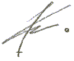
The Electric Company! How sweet was that show? If you even know what I’m talking about. TEC went of the air in 1977 (1985 via reruns), so this was drawn sometime before ’85. A cartoon of a Martian landing on a planet was on so I wanted to draw my own spaceship. As you can see, all those wires are very critical to the craft’s proper operation.
 Old Bald Eagle, 1979, pencil
When presented with this question, I tell people I try to be. When I think of "artists", I can't help but remember the masters of old. To me it seems a never-ending process to achieve their level of skill. Renown art instructor, Robert Beverly Hale, sums up the goal well when he says "no artist can be called an accomplished craftsman until all matters of techniques are so well learnt that they are part of his subconscious equipment." *
This process, this journey of improvement, is what I like about art. Slinging the paint and dragging the charcoal over the page is where I find the excitement. Therefore, I always expect to be on the road to becoming an artist - and I enjoy that road. Maybe when I close my last sketchbook or dry my last brush, maybe then I'll be an artist.
* Robert Beverly Hale, Drawing Lessons from the Great Masters, 1964, Watson-Guptill, p. 13
WHY DO I DRAW?
I draw and paint for the simple fact that you can create any picture you want. A pencil or brush can construct things that have never existed and lend perspectives seldom, if ever seen in nature. The inanimate tools of an artist bring to life our imagination and convey dreams to the eyes of the world. I also feel compelled to do it (draw) any time I have a pen or pencil and a surface to draw on. I think this impulse is in everyone. We all doodle in class or "improve" the cover of a phone book. It's just that many people stop there.
MY FAVORITE MEDIA?
Often, it seems the simple graphite of a pencil gets overlooked as a pure medium, but it is nothing short of the cornerstone for many incredible creations. It is easy to use, it's everywhere and it is definitely a favorite of mine. Most works of art, from paintings to buildings to even machines, start with a sketch, and many of those are initially done with nothing more than a pencil. If we only knew a fraction of all that was conveyed for the first time with pencil and paper, we would be amazed.
Another favorite of mine is watercolor. People usually cringe at the though of watercolor. Admittedly, it is slightly less forgiving than other media, but I like if for the effects it gives. The transparency, the spectrum of single colors, the way the water pulls the pigment across the page is unmatched. Mastering the volatility of watercolor is a challenge that I expect to last as long as the journey to becoming an artist.
I WISH I COULD DRAW OR PAINT.
How many times have you heard that? Or said it yourself? I have one response to this comment – you can! We all can. What’s important to remember is to avoid comparing or judging your drawings against other art. You'll never be able to draw or paint like me, BUT, I could never draw like you. That's what makes the incredible diversity of art. This difference lends creativity. How dull things would be if we all had the same vision!
Take the pencil, the pen, the paint, and let them convey YOUR interpretation of the world. Draw an apple. The lead becomes an apple – the apple in your mind; the apple as you see it. It is completely yours and it is good! Expressing our uniqueness, our creativity, stems from the refusal to quit simply because our results don't match those of another. So draw if you want to. Paint if you want to.
A famous portrait painter, Frank Covino, also explains this individual creativity:
Talent is comprised of basic human traits that all of us hare to one degree or another - the capacity for focus, discipline, patience, diligence throughout creative acts and a perfectionist's assessment of self-achievement that results in total gratification. Talent surfaces early in some, but can also happen late in the lives of those who have a high capacity but don't discover it until they're confronted with a qualified environmental influence. - Frank Covino in May 2000 Artists' Magazine
- top -
A LOOK BACK...
Here are some embarrassing pictures - a good way to practice humility. These date back to 1976, and arranged in chronological order – oldest to newest (as well as I could remember).
 Alien, Circa 1976, pencil
The Electric Company! How sweet was that show? If you even know what I’m talking about. TEC went of the air in 1977 (1985 via reruns), so this was drawn sometime before ’85. A cartoon of a Martian landing on a planet was on so I wanted to draw my own spaceship. As you can see, all those wires are very critical to the craft’s proper operation.
 Old Bald Eagle, 1979, pencil
I’ve always been amazed with bald eagles and I distinctly remember drawing this - I was waiting to go somewhere with the family. Obviously, my knowledge of bird anatomy was far from advanced. This is more of a turbo eagle with enormous wings. My mom said it was nice - Moms are good that way.
 Red Flower, 1980, colored pencil
 The Machine, circa 1980, pencil
 Face 01, 1984, pencil on parchment
 Face 02, 1985, pencil on parchment
 "Blind" Body, 1985, pencil on parchment
 Doodle Card, 1985, pencil on index card
 Elephant, 1986, pencil on notepaper
 Horses, 1987, pencil on notepaper
 Telephone Line, 1988, watercolor
 Doodle in 3D, 1989, pencil on notepaper
 Cuticle, 1989, pencil
 Technical Vice, 1989, India ink on acetate
 Bad Apple, 1989, watercolor
 Skeleton Fire, 1989, pencil and watercolor
 Self Portrait, 1989, watercolor
 Think Apple, 1990, pencil
- top - Red Flower, 1980, colored pencil
Before getting into watercolor, I remember trying to 'master' other media - one of which was colored pencils. I still like them, but find it difficult to get the color and texture I know others can get. I drew this in our backyard and amazingly, got up early to do it. It was summer and that was the best way to avoid Nebraska's ruthless sun and humidity (at times).
 The Machine, circa 1980, pencil
Machines have always fascinated me - “building” my own was a fun thing for me. Making up any add-ons was the best part. I was always able to explain how everything worked – at least in my mind. This crazy thing flies (you can see the wing on the middle of the body). There is no doubt seeing Star Wars helped the inspiration.
 Face 01, 1984, pencil on parchment
This is another exercise from junior high – this time with a focus on contrast and shadows. The biggest critique I always received was not using enough contrast, not being bold enough with my lines – too light! That is good advice and I thank Mr Beranek for it. This was good practice for me.
 Face 02, 1985, pencil on parchment
Another junior high drawing, but no exercise involved. This was simply draw what you see, which I enjoyed. You can see my recurring hesitation to go BOLD – this is so light you can barely see it! One cool thing about a classroom full of eighth graders is there’s never a shortage of live models. Despite the weak rendition, I can remember who this was after all these years.
 "Blind" Body, 1985, pencil on parchment
This was drawn in 7th grade art class and is a copy of a painting (sadly, I don’t remember which one.)
The exercise was to avoid the temptation to continually monitor your drawing and/or stopping to make corrections. We did it by covering our hand and the drawing surface with another large piece of paper. It’s a good thing to try and the result is always a surprise.
 Doodle Card, 1985, pencil on index card
I doodled on anything in class. This was an index card I used as a bookmark in English. I took some English 'notes' on it almost every day. I still refer to my doodles as 'notes'. Very few get what I'm talking about, but I like to tell them I take a lot of 'notes'.
d
 Elephant, 1986, pencil on notepaper
This was sketched in a time I was focusing on getting better at drawing animals. There was another motive, however. My mother likes elephants and I was formulating ideas for a painting to give her as a gift. It’s funny how even young (at the time) artists take “artistic liberty” with their work. Although my mom favors Asian elephants (with the small ears), I prefer African elephants (the aggressive ones with huge ears). Looks like my choice won out. I did make the painting but my mom still graciously hangs it.
 Horses, 1987, pencil on notepaper
Horses are amazing to me - specifically how such a large, heavy animal can run around like crazy on such small ankles and feet. Despite the fascination, I always need practice drawing humans and animals - both of which are difficult (for me) to draw well.
 Telephone Line, 1988, watercolor
I was in a painting class in high school and needed a subject so I took a stroll behind the school. I saw this telephone line through some pine trees and thought it would work. As per my normal fault, I didn’t use much contrast or bold lines. I painted the entire thing with a ‘dry brush’ technique in which small amounts of paint are applied with careful strokes.
 Doodle in 3D, 1989, pencil on notepaper
I guess my doodles were getting more sophisticated and I was working on shading in pencil. This was also done in English class.
 Cuticle, 1989, pencil
As much of my work shows, hands have always been a favorite subject of mine. I thought I’d make a surreal sketch with a hand and building. The hand's 'cuticle' shows a rather large building glorifying the big city. The additional irony is that Ravenna is a really small town. The building is five stores tall - and there surely aren’t buildings that tall there (minus the grain elevator).
 Technical Vice, 1989, India ink on acetate
I took a drafting class my senior year in high school and this was the final project. The subject is a simple vice but when you break it down, it becomes a lot more complex. This reproduction is poor but I was happy with the real product. It can be frustrating working with India ink on acetate. India ink has the qualities of watercolor when wet but becomes almost permanent when dry. Its qualities when wet (primarily smearing) were accentuated working on a plastic surface.
 Bad Apple, 1989, watercolor
I was working on painting and drawing mouths. So I thought I would make an action shot of eating an apple. The surprise for this guy is the bad spot but he will find out soon enough. Obviously, the anatomy isn't very accurate and more practice is indeed required.
 Skeleton Fire, 1989, pencil and watercolor
I was sketching some skeletons trying to better understand the human form. I added the red to make a strong contrast with a hint of surrealism. You can see that the neck bones are rather elongated - not unlike Botticelli's Venus. Obviously no comparison, but I guess everyone draws with their own quirks.
 Self Portrait, 1989, watercolor
This might be my most embarrassing and humbling piece - exactly why it’s in the Look Back. Minus the fact that I look like I’m wearing lipstick, the overall result was much less human-like than I imagined. Like I’ve said, I always need practice with the human form and it’s quite a challenge for me.
 Think Apple, 1990, pencil
At the time (senior in high school), I thought this was a really original idea. I think I was eating a lot of apples then. I actually painted a version of this, too. Why? It’s beyond me. This was drawn at the end of my senior year when I would stay up until 0200 or 0300 in the morning finishing drawings and paintings. I loved that time – still do. That was the benefit of a school day that started at 0830.
-mm-
No comments:
Post a Comment