One nice thing about sitting reserve is visiting / seeing things you may otherwise not. San Fran obviously has plenty to see and on my most recent visit, I Ubered over to their Museum of Modern Art - SFMOMA. On the way over, my driver said that de Young is better. Not necessarily what I wanted to hear, but now I have my next place to visit. Overall, I thought the SFMOMA was great. Plenty to see, on site eateries, and a very nice building. It is a hair expensive, but welcome to California and/or San Francisco. Here is my summary of things that caught my eye, but are in the order of viewing - not necessarily their meaning / attraction to me.

The entry - completely downtown.

my ticket


Left: Franz Marc, Steiniger Weg (Stony Path), 1911/12
Right: Arthur Dove, Silver Ball No 2, 1930
Years ago I paid little attention to expressionism, cubism, or most abstract art. I was of the notion that if a painting didn't look real, it was a waste of time. That has changed and Marc's painting is something I can really appreciate. I think it's wonderful and still conveys exactly what he wanted to convey. It's also 108 years old which I think is amazing. It seems so ahead of its time. Dove was an early American modernist, and is often considered the first American abstract painter. I thought Silver Ball No 2 was great. Just a silver ball on some kind of a stand with a great landscape...simple.


Left: Josef Albers, Homage to the Square: Starting, 1968
Right: Henri Matisse, Femme au chapeau (Woman with a hat), 1905
"Homage to the Square" is actually a series which occupied Albers for 25 years and includes hundreds of paintings. I'm not necessarily a huge fan of this work, but no matter what anyone says...he did it first. In other words, if the thought is 'anyone could do that', the answer is, but they didn't. Albers is famous for squares. Further, when you realize he was more interested in how your eyes perceive and manage the colors than the square itself, you'll probably give him some slack. I had to take a picture of Matisse's "Femme au chapeau" just because. It's a painting of his wife, Amélie, and the hat is likely one of her creations. Matisse was asked what color of dress she was wearing. He said "black, of course". That's awesome and probably true because he didn't need a colorful dress for his mental palette.


Left: Roberto Matta, Chamboles les amoureuses (Lovers in Shambles), 1946
Right: Max Ernst, La famille nombreuse (the Large Family), 1927
I have liked surrealism for quite some time, but I don't particularly like Matta's painting shown here. What really caught my eye (I actually walked back to the painting) was how the figures seemed to emerge from the painting. I was the excellent technique of the background that pushes them forward. The background is out of focus when compared to the crispness of the figures. I'll imagine he did this on purpose, but it's one of those things where it might have just worked out. Ernst was a prolific artist and a pioneer of the Dada movement and surrealism. He's credited with the 'invention' of frottage and grattage. Artist's, right? But I do love this painting. Not sure exactly what it is...the darkness, the shapes, the highlights. I think it's great. I struggle with boldness when I paint so maybe I'm a bit envious.

Aaron Lade, Northwest Maroon, 2020
So here's the thing about art. If you like it, you like it. If you don't, you don't. If you try to hard to understand it, you'll probably be frustrated. If this were hanging in a museum of modern art, you would see dozens of people stopping by daily and pondering its "depth" and all the emotions it evokes and etc, etc. It would be considered 'worthy' because it's in a museum. The reality is, this is a picture I accidentally took of who knows what. Art. On that note, the amount of time I usually spend in a photography exhibit is the amount of time it takes to walk through it. If you like it, you like it - and in those instances it might take me longer to walk through. But sixteen pictures of a bed with different flowers in the center is to me, lazy. And then the audacity to call it "Untitled" just flaunts the laziness. I still separate art from photography. In my world, photos in an art gallery are photos in an art gallery. That's no comment on the quality or effectiveness of the photos. In fact, when you have to work for a photo, that changes things.


Left: Mark Rothko, No 14, 1960, 1960
Right: Yves Klein, Untitled Anthropometry (Ant 154), 1961
It's hard to comment on this painting. It's simply a work that grabs my attention. Simple, geometric, but not geometric, and great colors. Just for a point of reference, another Rothko painting, "Orange, red, yellow", which captivates me much less, sold for 86 million in 2012. People like what they like. Klien's "Ant 154" is one of his works where he's using what he called "living brushes". Models drenched in pigment would imprint their bodies on large sheets of paper while an orchestra played one-note symphonies composed by Klein. The pigment was IKB ... International Klein Blue. He made his own pigment to match his universe. I liked the flow of the painting and the 'living' edges.


Left: Edward Hopper, Intermission, 1963
Right: Ellsworth Kelly, Cité 1951, 1951
I think Hopper's work is great. He was a realist and his ability to capture all he captures in his paintings is what I would say is "it". He's got 'it' and artists strive to have 'it'. This painting is to some "ho-hum", but even if that is your take, you can't help but build your own story. It makes you stop and think. Why is she there alone? What's the show or event? What's her deal? Why didn't she leave during intermission? Many paintings make you ask what it is or what it is 'supposed' to be, but Hopper forces you to invent a story while he taps into all your memories. I only posted Kelly's work because he had a dedicated section in the museum. One thing I did like about his take on art was his works were never representations of anything. His works stemmed from isolated images that caught his eye. Perfect for those who struggle with the "what is this" question. It's nothing. Rather it's the emotion sparked by a random sighting.

Left: Clyfford Still, (unknown)
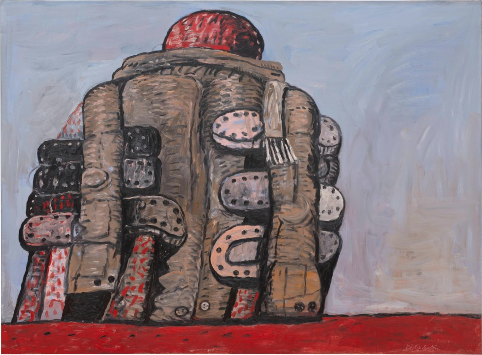
Right: Philip Guston, Back View, 1977
I liked the edges and colors and 'nothing' of Still's paintings. He was one of the leading figures in the first generation of Abstract Expressionists, but seemed a bit of a snob. He believed you couldn't appreciate his art unless fully immersed. He would refuse exhibitions and sales unless he was guaranteed all his work would be displayed together. Classic artist. I don't necessarily like Guston's work, but I thought this was a great representation of a back view. It is when he departed from abstraction and started depicting identifiable subjects. He clings to coats and shoes although the why is unknown.


Left: Sigmar Polke, The Spirits That Lend Strength Are Invisible I, 1988
Right: Gerhard Richter, Lesende (Reader), 1994
I liked the size and abstractness of Polke's work. The one above is tellurium and artificial resin on canvas. That might not mean much, but to the observer, it's shiny. That's an interesting twist on an abstract painting. I think he enjoyed the medium more (or as much as) the image itself. And this is a very large painting which is always a bit more impressive. Initially, I walked right through Richter's exhibit. But then I realized these 'photos' were paintings. He has a skill of adding just the right 'movement' in his paintings which is impressive in paint. The reader above is holding a paper with some slight wrinkling and her hair is actively reflecting the light. There was another painting of a girl on a swing and her hair was flowing in the breeze. At the time of this post, he is still alive at 88 years old.

Gerhard Richter, Mirror, Blood Red, 1991
Another Richter, this is oil on glass. I thought it one of the best paintings (because I'm in it and anyone can be in it), but it's also eerily similar to Northwest Maroon (above). Other than being reflective, this isn't much different than the random picture I took of who knows what. But this piece is large and in a gallery so it must be better, right? I say that in jest - not to distract from Richter's work.
If you're in San Francisco and have the time, I highly recommend a visit to SFMOMA.
- mm -
1 comment:
Been to both during my off time there. I think SFMoMA is far better. But, Art Institute of Chicago is the best so far (esp the ticket price as a Corp sponsor).
Post a Comment