Showing posts with label japan. Show all posts

2023-01-24

Japanese Cliff : 2023-01

Japanese Cliff
24 January 2023
Acrylic on canvas
16 x 20 inches (41 x 51 cm)

This painting was from a sketch for a potential 2002 Christmas card, but the sketch was from an outing in Japan. We climbed the face of this cliff and it was one of those times you realized how high you've gone when it's time to descend...and I never remember the steps. It was a cool cliff with a surface only interrupted by by a few cracks and a couple trees reaching from the cracks. I'm glad I finally painted it.

This painting started on another repurposed canvas. This might look familiar since Waiting for You also started on a similar scene - likely from the same painting event. The initial, fun part - experimenting with random colors for the sky. The green didn't feel like it was going to work, so in came the blue.

Next, I added the basic rock formation and threw in some crooks and crannies with a pallet knife. Then began the search for the right color of rock which took quite awhile (many versions). I kind of still like the above right and below left versions of the cliff.

Getting a little frustrated with finding the right color, I finally laid down a solid color on the left side of the cliff and re-brightened the right side.  Added the branches and finished the final version with the foliage and lighter clouds.

This painting is in a frame very similar to this one.

- mm -

2008-12-05

miyagi japan

Traveled to Miyagi Japan in December 2008. It was a great trip (traveled / worked with great people) but it was a rough trip, too. I had just lost a wonderful girl in my life. The trip to Japan the previous year (Dec 2007 to Sendai) was awesome. We lived off base, froze at work, but had a great time. I also traveled with great people on that trip.

2008-07-07

Osaka Castle Museum

I had a pretty long layover in Osaka so I took the train into town. The Osaka Castle seemed like the thing to see since it was in the middle of town. The museum didn't have a huge collection but it's always cool to see these types of buildings and there was a great view of the city from the top floor. The website is: http://www.osakacastle.net/english/

2007-12-05

sendai japan

Traveled to Sendai Japan [Wiki or another site] in December 2007 for a work-related exercise. Traveled with great people and since we lived off base, we had an awesome time. We even visited Sendai's Sapporo Beer Garden. If you haven't been to a Sapporo Beer Garden (the link is to the original, but the idea is similar in other locations), it's definitely worth the visit. This was a great trip and Sendai's city center was all decked out for Christmas.

2004-12-15

cc2004 | Christmas King | 2004

Christmas King, 2004
Watercolor and India ink on rice paper, 35 cm x 70 cm (Kellett collection). The card read: I’m not sure where the concept came from and it may not be what you’d expect for a theme. It also has no Italian influence (where I painted it). Once again, if any influence is here, it would be Japanese, painting it with Sumi (black ink) on a rice paper scroll.
As Christmas ushers in the true King, I felt the king fisher would be a nice match - not only in name, but with its demeanor. These birds don't seek to present something they’re not, they are simply excellent anglers. On the contrary, we often make Christmas something it’s not.  This year, I had 150 printed and stayed with Shutterfly.
My comments - I loved this bird and the final painting. I love the effects of India (sumi) ink, and this helped me remember the pleasure of working with it.

the sketches...


Christmas King 01, 2004, pencil on paper. I'm not sure why, but I got the idea to include a bird in the 2004 card, and wanted to involve it with the ornament. This first drawing had the bird (an eagle or hawk) holding or tying the string. There are a couple interesting things to note.

First, you might notice this sketch (the first sketch) is much more detailed then the rest. This is typical of my projects. I dedicate the most time to the first idea, quickly sketch any variations and again draw with more detail once I have the final image.

Second, this is the first time I can remember when I stayed with the same theme from start to end. Normally, I don't like my first sketches and switch to a completely different idea. This year, the bird made it.


~~~~~

Christmas King 02, 2004, pencil on paper
This is a very rough sketch but the intent was to explore birds other than a bird of prey. It was also useful to make different variations of how the wing would be displayed. You can see two upper wings, one back and the other more forward. I liked the swept back wing, but it made the bird appear to be diving.


~~~~~


Christmas King 03, 2004
Pencil on paper

Here are a couple more, non-prey birds but now I've closed their wings.

I liked the bottom bird and he has a Christmas look. Neither bird however, seemed to grab much attention.


~~~~~

Christmas King 04, 2004
Pencil on paper.
I liked this bird - he seemed to be more dramatic and able to catch the eye. This might have been the subconscious bridge to the king fisher. This bird has some of the same ragged features.


~~~~~

Christmas King 05, 2004
Pencil on paper.
The first (and last) sketches of the king fisher. As you can see in the finished product, the bottom king is the one I used.

Interestingly, neither are beak-down nor facing the viewer. However, I liked them right away and thought it was cool to show they don’t have to face you to know you’re there. Although I used the bottom bird, I preferred the top bird - he seemed a little more dressed up for the season.


~~~~~

Christmas King 06, 2004
Sumi on rice paper, 30 cm x 90 cm

I often don't sketch with other than pen/pencil, but for some reason I did for this project. I was strictly using Sumi (Japanese black ink).

This is an interesting point. Sumi originated in China around 200-300 A.D. and is vegetable carbon based. India (or Indian) ink is the American label for black ink and is originally derived from non-electric lamp carbon.

Both can be found in liquid or solid form, but Sumi is traditionally solid while India ink is normally liquid. The biggest difference is India ink contains shellac and Sumi doesn't. I will most likely continue sketching certain projects with ink/color since it's the best way to see actual appearance.


~~~~~

Christmas King 07, 2004
Sumi on rice paper, 35 cm x 45 cm

Initially, I wanted to place the bird in a dramatic pose and here I was entertaining the idea of birds in-flight.

They are both beak down since the original idea had the bird placing or holding the ornament on the tree. I liked the lower bird and for a moment planned on using it.

You might’ve notice these sketches are slightly out of sequence. I.e., the final was the fifth sketch in pencil. The painted sketches weren't necessarily after the drawings, but I wanted to group the painted work together. So, these first few were painted before I pencil sketched the king fisher.


~~~~~


Christmas King 08, 2004
Sumi on rice paper
This is somewhat of a cross between the two birds in Sketch 07 but as it progressed I began to really dislike it and started making careless strokes - evident on the bird's right wing.


With the remaining ink, I quickly sketched a tree ornament to see how it’d look.


~~~~~

Christmas King 09, 2004
Sumi on rice paper

Although the previous sketch was aborted, I still liked the bird and the idea of affixing the ornament while still in flight, so I made this sketch along the same lines.

Since I thought I might use this bird, you can see I spent a little more time on it and added more detail. I still think this could make a good painting and some color would really bring it to life.


~~~~~

Christmas King 10, 2004
Sumi and watercolor on rice paper
Enter the king fisher. Looking at it now, I guess I did follow my standard act - drew and sketched several of the same things, but made a switch to a completely different bird and pose. I did, however, stay with the fowl, so I guess it’s more of an intra-shift.
This was the first run and I really liked him but I painted on a piece of rice paper that had been folded and I couldn’t get the creases out. If you look closely you can see them running through his eye to belly and across his neck.

UPDATE (~ Oct/Nov 2015): despite the creases, this king fisher was published! He made it into Strokes of Genius 8: Expressive Texture, The Best of Drawing.  A 144 page collection of 139 works of art.  I was quite pleased.

This is the cover of the book and it's available here.
~~~~~


Christmas King 11, 2004
Sumi and watercolor on rice paper
I repainted on a different piece of paper and was please with this bird. I calmed down the feathers a little bit and lowered his cranium to try and get a sleeker appearance.  Sadly, I painted him on the bottom of a scroll with zero room to add the branch and ornament so I painted him one more time - which was not a sketch but the actual card.

Go to the Cards or the Galleries

-mm-

2003-12-15

cc2003 | North Island Noel | 2003

North Island Noel, 2003
Watercolor, 21" x 15" (private collection). A rather dark theme for a Christmas card.  Let me shed some light on it. I saw this scene (on Japan's North Island) and it really made an impression on me. An amazing, eerie sky and landscape broken by the glow of this steeple.  It beckons you to enter its sanctity and join those celebrating the warmth of a very wonderful night - Christmas Eve.
My comments - I liked the concept and loved the photo of the actual site, but I needed to increase the boldness and contrast.  Holding myself back again. 100 cards were made using Shutterfly.

Musket, 2002, Photograph
North Island Noel (original picture above left) and another shot as we walked by. I'm a sucker for dark scenes with contrasts like this. I was really happy that it turned out. This picture was the inspiration for the Christmas card of the same name. This was taken on the north island of Japan, Hokkaido.

Go to the Cards or the Galleries

-mm-

2002-01-26

Crab Eating Guide

Crab Eating Guide
Musket, 2002
This was on a table in a cool restaurant in Hokkaido. It's such classic translation, but it still gets the point across. And it's a great read.

-mm-

2001-12-15

cc2001 | Christmas Grain | 2001

Christmas Grain
15 December 2001
Watercolor on paper
11" x 15" (28 x 38 cm)


Watercolor, 11" x 15" (personal collection).  Similar to 1997's design, but with a retro twist.  A few of these old grain elevators still speckle the Nebraska landscape. The low, worm's-eye perspective attempts to emphasize the dominance in the otherwise flat plains.
My comments - it's funny how the palette of this card resembles that of 2002...a little auto transfer it seems.  Also similar, I liked this card and concept, but I don't think it was a public hit.

I had some glass and a mat that fit so I made a frame for this piece in 2023.
It's funny to write that and realize the painting is over 20 years old.

the sketches...

Card Sketch 2001e,
Pencil
This was the sketch that eventually turned into the 2001 Christmas card. It was the perspective that sold me. This low, look-up shot best exemplified the towering effect these old buildings had in Nebraska – both physically and economically.
~~~~~


Card Sketch 2001f
Watercolor
I was struggling with the right color for the wooden sides of this giant so I just started throwing some paint on this sketch. The image looks a little strange because I actually cut this from some cardstock. The final card is reversed but almost exactly the same layout.

Go to the Cards or the Galleries


Other preceding sketches...


Card Sketch 2001d (left)
2001, Pencil on paper
This was the last elevator I drew that wasn’t used. I liked it and I was getting closer. The angles and perspective were better but it was still missing something.

Card Sketch 2001c (right)
2001, Pencil on paper
Another in the series of grain elevators. This one didn’t have the worm’s-eye perspective I was looking for. The normal, rather flat perspective here doesn’t really show how these old giants dominated the landscape. Therefore, it was not used. I did, however, like how the “grain” turned out.

~~~~~~~~~~~~~~~~~~~~~~~~~~~~~~~~~~~~~~~~~~


Card Sketch 2001b (left)
2001, Pencil on paper
I'm often impressed with tall buildings - especially when they're in the middle of nowhere. This doesn’t really match the grain elevator theme, but the idea is the same.

Card Sketch 2001a (right)
2001, Pencil on paper
This started a series of old grain elevators I wanted to use for the Christmas card of 2001. I try to include something symbolic of Christmas, as we know it. In this case I used tree decorations as the “grain”.

-mm-

2001-11-10

Japanese Tree

Japanese Tree
Musket, Photograph, 2001
This might be one of the best pictures capturing Japan's technological way of life. Even the trees are built with carefully placed scaffolding.

-mm-

2000-12-15

cc2000 | Christmas Koi | 2000

Christmas Koi, 2000
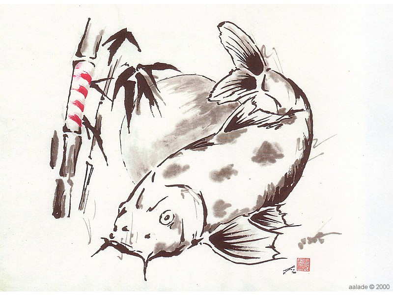
Watercolor and ink, 11" x 9.5" (Merry collection).  One of my favorite paintings with heavy Japanese influence - the Koi (carp).  My appreciation of these fish, which are symbols of strength, really grew when I discovered they can live to be over seventy years old.  The sketch had the fish in red stripes, but I thought that was a bit cheesy.  It was enough of a stretch to candy-cane the bamboo, but I liked how it turned out.  I also like the sphere in the background.  Random but worked.

the sketch...

Christmas Koi, 2000
Pencil
This drawing turned into Christmas Koi. Another sketch was involved – a close up of the fish and bamboo instead of the wheat looking stuff on the left. As you can see, the fish was going to be candy caned – I’m much happier it’s on the bamboo.

People ask me where I get my ideas. I don’t always know. For example, the sphere behind the tail has nothing to do with the theme, but it was fun to draw. It’s in the final painting and I think it works well. The symbol in the lower right is Kanji for Nippon (Japan). I didn’t use it, but it probably would have worked.

Go to the Cards or the Galleries

-mm-

2000-10-06

Crowday | 2000-10

Crowday, 2000
Watercolor and pencil on paper, 7" x 8.5", Merry collection. Crows! Crows provide a lot of entertainment if you watch them for a while. This was a card for someone who also liked crows. The crow is acting in their typical way - greedy. The present isn't his, but he doesn't care.


-mm-

2000-09-15

Birthdace | 2000


Birthdace, 2000
Watercolor and ink, 5.5" x 9" (private collection)
BirthDace? Fishing in Japan was something of a joke to my friends and me. We found out dace was a big target. I say big but dace are like minnows. Everything at that point became dace - dace of the week, happy dace, lazy dace of summer, and of course, birthdace. This was a card for someone's special day.


Used as a wedding invitation about five years later...

-mm-

2000-07-01

Samurai | 2000

Samurai, 2000
Pencil and ink, 7" x 10".  This was made for tail art on the F-16s of the 14 FS, Misawa AB, Japan. The Samurai are known for their fierce fighting spirit and endless search for the finest wood with which to make their weapons. This Samurai is fashioned after northern Japan warriors and the Kanji on the helmet reads "fourteen". Samurai are celebrated in the Nebuta Festival held in August in Aomori.


LEFT: Pencil and ink, 10" x 14". This version equipped the Samurai with their weapon of choice. It definitely made him more complete – and fierce.

RIGHT: Pencil / Ink, 7" x 10". This color version was used for a tribute to those who lost their lives and loved ones in the attack on the World Trade Center, 11 September 2001.

the sketch...


Samurai, 2000, Pencil. The original samurai sketch – this was a combination of a samurai from a Nebuta float and a fabric print that hangs in my house.


-mm-

1999-12-15

cc1999 | Christmas Tassel | 1999

Christmas Tassel, 1999
Watercolor and pencil, 8.5" x 7.5" (personal collection).  The simple decoration on this otherwise ugly corn tassel reminds us how we can make the most of any situation.  This is the year I began "signing" with my Kanji stamp which is a rough translation of my first name.  The final was almost a dead ringer for the sketch.

the sketch...

Card Sketch 1999a
Pencil

Trains were the planned theme for the 1999 card and I looked at many pictures and made several sketches. Then this idea came out of nowhere – and that was it. I drew one sketch (shown) and made the final product. By the way, those are how my best cards happen; wrong track, wrong track, hello completely different idea! (pun intended).

I don't think of myself as cheap, but most of my drawings are on pre-used paper. That should explain the images behind a lot of these sketches.

Go to the Cards or the Galleries

-mm-